FOOTWEAR – Get the Basics Right to Drive Sales
By Hamish Caunter
Over the last five years, footwear has become an increasingly important category in surf and action sports retail. Ok, footwear has always been the key category for Skate, but for surf distribution, as apparel has become more street-influenced, the importance of footwear has increased to complete ‘the look’.
Footwear as a category is, on average, 15% of total business. To increase sales from what is essentially, a fixed space, means generating more sales from the same space. Increased revenue means more profits for you, the storeowner, right?
So here are some tips on how merchandise your footwear walls and increase your profits.
I wanted to cover two things:
1) The basics: getting the basics right is the starting point of anything.
2) Factors that go into displaying and selling footwear.
The combination of these points will help merchandise your footwear wall and drive profitability.
Sample Shoe Presentation

THE DO’S AND DONT’S OF A SHOE DISPLAY
First and foremost the shoes have to appeal to the customer. Here are the A, B, and C’s of presentation:
- Ensure the product is clean. Regularly pick the display shoes up and remove dust.
- Stuff the shoe but not over or under stuffed.
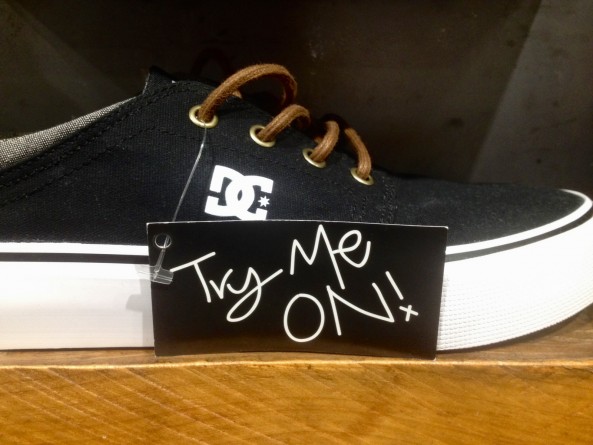
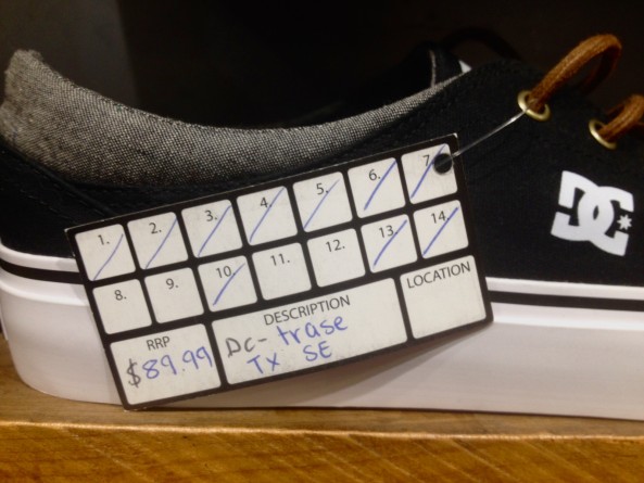
- Have a good system to display the price and what sizes are available. See images below of Amazon’s (NZ) system. It’s a great system.
- Ensure when the display pair is sold that a new display shoe is created.
- Place the display shoe in an appropriate size (9 for men and 7 for women).
- If you stock large sizes (14-18), give them their own space on the footwear wall. You will sell more that way!
- If you don’t have enough styles to fill the entire wall, double expose your top sellers!
- Ensure laces are neat, uniform and tucked away.
- All display shoes should be lined up vertically and horizontally, rows and columns (See the photo below of Blunt Skateboarding Co).
- Ensure the shelves or shelf talkers are clean.
Footwear Walls – Position in Store
The location of the footwear wall within you store is more likely for a much bigger discussion than what I can offer here, but if you are reconsidering moving your current footwear position in store, here are a couple of points to think about.
The placement of your footwear wall within your store is ideally in a neutral zone. This allows all styles for men, women and youth to be in the same place, nice and neat. As an added benefit, this does not polarise a particular consumer group and is especially important now when there is a strong trend in unisex sizing. (For example; Vans Authentic, Converse Chuck Taylor).
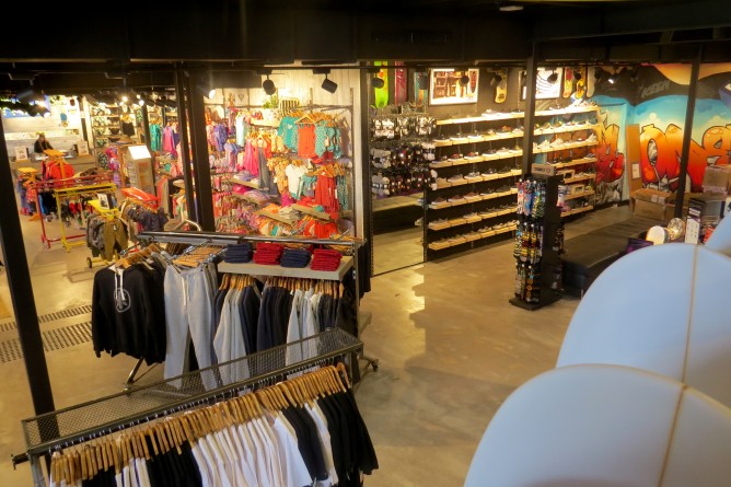
FOOTWEAR WALL PLACEMENT
Ultimately you will know your business. If you predominantly sell men’s footwear it might make more sense to have it close to the men’s apparel. You have to use common sense and what space you have available.
I did go to one store that had their Men’s footwear range at the end of the women’s apparel. Funny enough, they told me Men’s footwear wasn’t that strong for them…
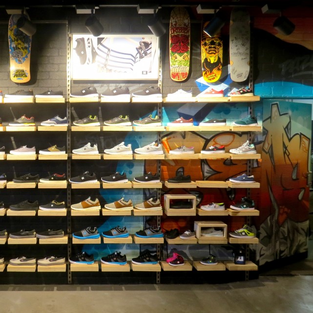
The photo above shows Boardriders Torquay DC Shoes footwear wall. To service all customers it is positioned at a juncture between, Roxy, Quiksilver and DC apparel.
Footwear Walls – Slat Wall / Shelving
Another debated topic is slat-wall verses shelving verses a ‘fancy new system’.
Some have tried other ‘fancy new systems’. I have seen cubes, things hanging from ceilings etc. but the good old slat wall or a shelving system is best every time. Keep things simple.
Slat wall allows you display shoes in a neat and uniform way. Everything has a home and if you see a gap, then you fill it. It also means you can leverage the power of brand shelf-talkers.
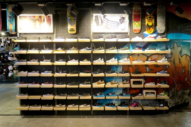
FOOTWEAR WALL LIGHTING
Shelves are good as they allow good space to work from. When SKU’s are expanding or retracting due to sale volume or seasonal change, shelving means you can easily re-organise things.
Lastly, lighting is extremely important to your footwear display. The goal with lighting is to highlight an object so that the customer will want to purchase it. Boardriders is a good example (photo above). It has strong track lighting above the footwear wall to highlight the product.
Blunt Skateboarding Co, in Torquay (photo below) is also a great example of footwear display for both location in store, use of shelves, vertical/horizontal alignment and lighting.
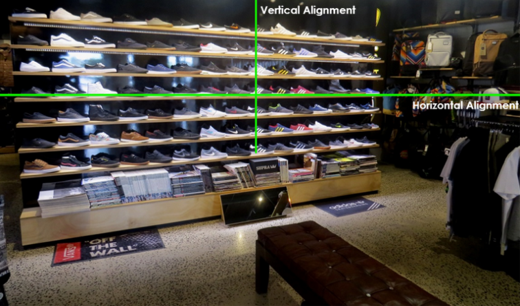
BLUNT SKATEBOARDING CO’S FOOTWEAR WALL
Footwear Walls – ‘Hot’ and ‘Cold’ Space
The last important aspect to mention is hot and cold spaces on an footwear wall (shelves also).
The most uniform and logical way to sort a wall is by brand. Within our industry footwear is a similar type (skate/surf/lifestyle) and the brand is what separates products best.
In contrast Footlocker, for example, has casual, running, basketball and training categories and therefore groups it products by those categories.
To set your wall up you need to rank brands by whichever metric is important to your business. Then place brands on the wall in their respective order as per the diagram below. This method capitalises on performance and accentuates it.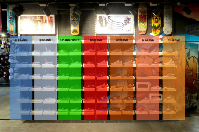
RANKING BRANDS
The rationale to having a footwear wall set up like this is because, in general, consumers walk to the centre for the wall and then look right. (Looking right comes from looking right when crossing the road or reading from left to right). Note the ‘Up and Comer’ row. This area can catch consumers’ peripheral vision and if the product is compelling, can draw them in.
Storage
Storage is important because if your staff has to go out back and keep the customer waiting, that’s not good service and it costs you money! Secondly, if they go out back and can’t find what the customer wants, a sale is lost and it cost you money! Thirdly, footwear is bulky and if inefficiently stored can, literally, cost you money.
One of my pet peeves is when he display shoe is sold and not replaced with another. I saw this countless times when I worked in retail and it results in a possible sale walking out the door. A well-organised room can help mitigate this from happening.
Ideally, keeping brands then styles together, in size order, is the best way to go. To go to the next level, if you look at the Amazon example from the image above, it also has an area to record the location, which can correlate to where in the storeroom that style is located
If you have singles left over that are being pulled from the wall and kept for sale at a later date, store them in a separate place all together.
Keeping the back room organised is the starting point to having an organised footwear wall.
Consumers have high expectations on the way products are presented in store. You can’t expect them to tell you when you have nailed it, but one truth is for certain, they will remember something that is presented to them poorly.
Footwear is an important part of Surf and Skate business, therefore spending time on getting it right important to increase profitability.
* Hamish Caunter is National Sales Manager for DC Shoes
