It’s no accident that the most successful stores also look the best.
By Jim Buda
Of all retail types Surf retail probably works harder than any other. This is largely due to the broad product categories including, men’s, women’s, kids, youth, rubber, footwear, optics, watches, accessories, skate, bags, thongs, snow boarding gear, surfboards and surf accessories. These categories then get overlaid with perhaps as much as 20 brands. The result is typically an ongoing struggle between retailer, brand and product mix as to how best to manage and retail this level of diversity.
The complexity of product mix can then be further complicated by the mix of surf shop types. In 2014 we have retro, salty, mega, pulled together, corporate, slick, mono-branded and specialised.
The result of this matrix is a complex and sometimes difficult proposition to establish a clear and strong retailing position.
The challenge for a retail designer and the retailer is to try to create a retailing platform that can make sense of the inherent issues of surf retail and make a legible, functioning and comfortable retail environment. For any shop design, the most important aspect is getting a space that “feels good” when the customer walks in. The “feel” can be very tricky to get right. We all have experienced good and bad feeling shops, but it becomes very hard to gauge the feel of one’s own store. A good space will make retailing a much easier proposition.
The following are what I believe are some retailing basics:
1- The Right Space
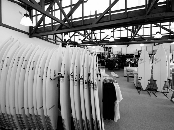
It cannot be stressed enough that the feel of any retail space is firstly the result of the space of the empty shell itself. A large high-volume space immediately feels better than a low ceiling in a deep space. The shell creates the vibe and the more difficult the shell the more work required to compensate. Secondly, the materials of the existing shell may work or not work in providing the vibe. Simply, a grid ceiling at 2.4m is a lot more boring, and harder to work with, than exposed old timber trusses at 4.5m. (Interestingly I have heard that Coles have done research that show that customers buy on price in low ceiling spaces and buy on quality in high ceiling spaces).
2- Buying the experience and visual merchandising
This is the mediation between the shop fit-out and the product. Good VM tells a story – about the shop, about the product and about the lifestyle of the store. If the customer buys into that, they will shop. Good retailers understand that purchases are not simple needs anymore. The customer wants to buy an experience. Those boardies are more than utility; they will surf better, look cooler and, above all, make the customer feel better. The path to making the customer feel better is getting them to buy into the experience on the shop floor. We intuitively understand this when we walk into shops that “feel good”. Retailers need to understand that they are not just shifting product, but that customers are buying an experience and the purchase will make them feel better. Shop design and VM should align to fill the narrative of the product experience.
3- Circulation
How customers read the space and how they engage and move through it is vital to the process of connection. It is axiomatic to say that the longer time spent in a store the more likely a sale. Good circulation means that there are few product dead spots and the deeper the customer goes into it, the more compelling the retail narrative. In a good shop customers will flow through the space without making any obvious conscious decisions. The more they have to think about the shop the less thinking they can do on product.
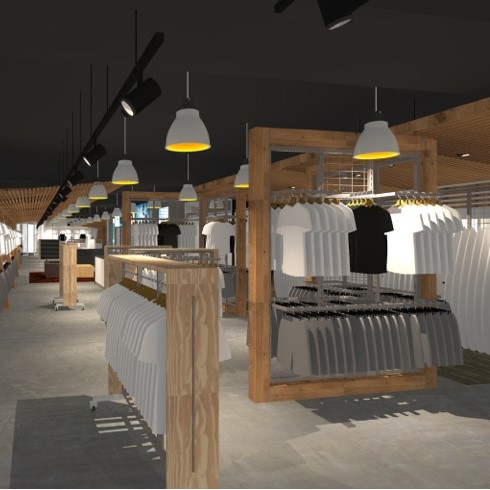
Generally customers move in a clockwise direction through a store and they move to avoid counters. The layout of the store should be designed to allow a simple flow without creating pinch points that hinder free flowing space.
4- Retail Flexibility
As retail fit-outs typically cost between $1k – $2.5k per m2 the capital cost becomes quite large. To make this investment most effective the fitout needs a long life. Longevity of fitouts (leaving aside issues of retail fatigue) requires robust finishes and flexibility in fixturing. The large mix of product needs to be moved around to suits changes of ranges, seasons and the vagaries of fashion shifts. This starts to preclude too much specialised racking, e.g. the custom bag wall or the custom cap wall. Unless this is space that you own these are best on more flexible fixturing. If joinery is customised for specific product it should have some ease of movement and not be in-built. There are plenty of examples where every display is product specific and fixed in place. This is pretty well retailing by numbers and what you saw in 2004 is pretty much what you see now. The same boxes, just different caps. Flexibility means that your shop can evolve and work with the VM over time.
5- Tell A Story
Retail has come a long way since the early ’90s when surf pretty comfortably hijacked machine-washable youth culture. Surf now competes in an aggressive marketplace and it needs to identify the retailing position that can maintain a point of difference while remaining core to central “surf” values. “Surf” in the end is a branding and marketing position and that position can cover positions from ranging from retro surf to urban surf.
A good shop fit-out tells a story and allows the customer to buy into the proposition. It means that the retailer needs to take a position with their shop and give customers a reason to shop there. I think that all customers need a bit of emotion to trigger the sale process and good retail sets up the cues for emotional triggers. In the end good retail is a bit of a voodoo science but good retail also gets most things right.
* Jim Buda is owner and chief architect at Jim Buda Architects and has designed many surf retail stores for Rip Curl, Saltwater Surf, Kirra Surf and others.


